16. Composition in Landscape - 15 Tips
Landscapes can be a wonderful, forgiving subject to paint, not only because they can be so beautiful. They also give you a great deal of freedom to change and interpret what you see, and the picture will still look and feel "right." Trees and hills come in all shapes and sizes, so no one's going to look at your painting and say, "Hey, I know that tree, it's actually a little bit taller and those two branches should be farther apart." No one's going to say, "That hill doesn't feel right, it should be steeper." And, no one's going to say, "Hey, I remember that tree, that shade of green is really too bluish and too dark." With natural landscapes, you can relax a little, and focus on painting what you want, not necessarily how it really looks.
Having said that, there are certain concepts to be aware of and mistakes to avoid. I will start with some basics, and tie in some great lessons I've learned from painters Stapleton Kearns and James Gurney, two artists who are far greater than I.
1. Let There Be Light, For It Is Good
Take a look at this painting, by Swedish painter Nikolai Astrup:
Nikolai painted in a modernist tradition, somewhere between post-impressionism, expressionism, and Edvard Munch's brand of symbolism. Details didn't matter much to him, perspective didn't matter, The location of the sun and the direction of its light didn't matter. Value relationships didn't matter - it's value neutral. Nikolai wanted only to compose pleasing shapes in a simple, relaxed manner, with some vague reference to the colors he saw, and to capture the charm of his rural Sweden. And it is charming, to a degree. Stapleton Kearns says, "Charm is the one quality that will redeem a painting bearing any other fault."
I may ruffle some feathers, but I would posit this painting is faulty. There is some indication of sunlight hitting the mountain from the right, with shadows on the left. But that same light would also fall on the valley below, and it doesn't - Nikolai just ignored that.
To ignore the light in your landscape is to ignore your landscape altogether.
The result isn't so much a landscape as a memory of one, like a quick little cartoon, scribbled in paint. Now, without adding any detail, focusing only on light and shadow, I doctored this painting in Photoshop.
What do you think? Better? Does it have greater clarity? Does it feel more lively?
I'm not saying all landscapes need a bright sunny day. Far from it, you can paint beautiful, dramatic, and powerful landscapes in all kinds of weather: grey, overcast days:
rainy days:
Storms:
Fog:
At night:
But, you have to actually look and capture those dramatic weather effects that you see, and most importantly, you have to observe the light. If you do, you'll notice the sky is always lighter than the ground. Here's another value neutral artwork. See how the ground is as light as the sky?
The whole painting feels white-washed. Just darkening up the ground really brings it to life:
Here's another beginner mistake, this time perpetrated by Bob Ross:
This is how Mr. Kearns fixes this tangential exit:
From this angle, the road leads your eye toward the focal point, not away from it (For more on tangents, see this lesson on Shapes).
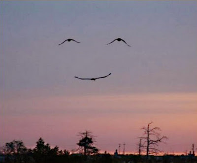
6. Beware Pareidolia
Pareidolia is a phenomenon unique to humans where we easily see things in random shapes - like clouds that look like rabbits or faces - we especially see faces in many different things:
Unfortunately, it can be an issue, particularly in landscapes. Mr. Kearns painted this example:
Do you see the hula girl in there? It might sound absurd, but it's actually really easy to discover faces in your artwork, and once you see it, it can be really difficult to unsee it. Here's a watercolor I made in 2010:
See a face? The one yelling at you:
I didn't intend for it, but that one tree yells at me every time I look at this piece. Now, don't get me wrong, pareidolia can be great to play with, if it's on purpose. Salvador Dali made great use of pareidolia:
As you can see, with art, rules are made to be broken - the main thing to understand is, it has to look intentional. Dali used pareidolia on purpose, and we know this because he didn't just break the rule a tiny bit, he broke it thoroughly, all over the place. Not like my watercolor above.
7. Beware of Equal Focal Points
Every picture should have a focal point - something that's interesting to look at. Most pictures have several focal points. But, they need to have a hierarchy. One focal point should be the most interesting, the most important. If you give two focal points the same compositional weight, you get what Mr. Kearns calls "One for each eye":
To fix this, choose which subject you want to be most important, and make sure nothing else competes with it. I talk more about focal points in this lesson on emphasis.
8. Beware of Bisecting Your Landscape
When you divide your composition perfectly down the middle, you fall into the same trap with those two trees above, it's like two different paintings, one for each eye.
Where are you supposed to look? The bridge or Big Ben? The answer is yes... Here's another example:
What's the subject of this picture? Are we supposed to look at the cliff on the right, or is it actually blocking our view of the water behind it? Also notice the lighthouse at the top touches the frame - a tangent.
9. Beware of Blocking Your Subject
Take a look at this photo:
Is that one tree particularly pretty? What would you rather see, that tree, or the clouds rolling over the sunlit mountain? Does it remind you of when you're trying to take a photo of your friends, but people keep walking in front of your camera? I took this photo with the intention that if I ever painted it, I would remove the tree. Overlapping is nice and provides depth, but you have to be careful not to block the most beautiful parts.
10. Beware of Having No Subject
Some beginners will simply paint what's in front of them with no concept of whether it looks good. Mr. Kearns has developed a great test for this. If your painting is so empty, dull, and boring:
that a burning phonebooth would actually improve it:
Then the composition is a failure. It sounds crazy, but it happens, and the main culprit is often a flat landscape on a bright, sunny day with no clouds:
It makes great picnic and soccer weather, but not for painting. When you're a painter, and you live in a place like this, clouds are your friends:
11. Beware of Profile Views
A profile is a side view - of anything. Profiles in portraiture can be exquisite:
12. Beware of Painting Potatoes
This is another lesson from Mr. Kearns. Now, I love potatoes, but they aren't exactly lovely to look at:
A great artist can paint a lovely pictures of a potato, it's possible, I've seen it:
But, like with pareidolia, you don't want to do it by accident in your work. And, what I mean is, very often, a beginning painter will see a complex shape, like a rock, a tree, or a cloud, and simplify it to the extent it no longer feels like a rock, tree, or cloud. The resulting blobs more closely resemble, well, a spud. This is due to a real lack of observation. Nature is full of subtleties an artist must see and capture. Here are Mr. Kearn's examples:
You see how these shapes aren't very pretty? They're non-descript, vague indications of shapes. Compare that with the beauty of real observation:
Notice how the rocks here are more angular. Note the great variety in size. Sure certain parts are rounded, but there are also flat planes and cracks and other details - things that a potato wouldn't have. And, see how the tree trunks and branches in no way resemble a blobby potato? This is real observation. Here's another example:
There are two lessons in this. First, with practice, this problem should generally go away by itself. Second, if you ever paint from life, and you see something that reminds you of a potato, or worse...
Ignore it. Find something nicer to paint.
13. Beware the Big L
This is more of an intermediate painter's problem. I explain in my lesson on emphasis that it's common to place your subject just outside the center of your picture, to free the eyes so they can wander around a bit. That's fine, but then you have to have other areas of interest. If there's nothing else to see but your contrived 'L' then there's no reason to let your eye wander, and you instead have a bad painting.
There are many examples of artists painting L's, some successfully, and others not. It's become quite a cliché in landscape painting:
Do you agree that these paintings feel artificial? Contrived? Does the placement of these trees feel thoughtless?
14. Beware of Stripes
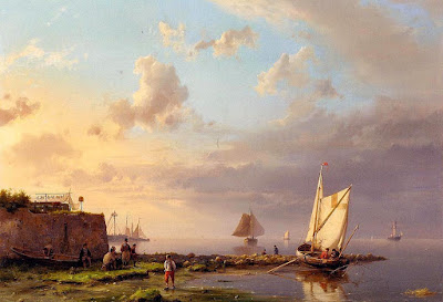
This is an issue around rivers, ponds, lakes, and harbors. Mr. Kearns refers to these paintings as "three stripers". You have water and sky with a strip of land in between. And what's wrong with that? Well, it's not so descriptive, is it? If I asked you what body of water that is above, what would you say? Can you recognize it? Is there any way to tell it's a river verses a lake? No, and it's so featureless, it's boring.
There are ways to fix this. I recommend a longer, wider canvas, to start.
And then, look for any variation to break up the monotony - introduce a little zigzag design into the scene:
15. Beware of Beaks


Comments
Post a Comment