4. The Principles of Composition 2: Shape Theory
All these principles are based on our shared personal experiences with shapes:
1. The larger a shape, the stronger it feels, no matter what it is.
Bella Donna, by Georgia O'Keeffe
The smaller a shape, the weaker.
Hello Up There, by Amy Lind
2. Sharp, pointy shapes are more frightening...
Winter Sky by Erwin Madrid
...than soft, round shapes (Note, how the overall ball-shape of the urchin still makes it cute - a curious dual emotion). The soft, fluffy cat below still has some slight frightening connotations due to its sharp stripes - and the sharp claws and teeth we can't see, but we know are present.
Sparks, by Heather Horton
When designing subjects and characters, the shapes you choose determine how people will react to them. Look at this example by Stan Prokopenko:
It's all just a question of bias, but looking above, which character seems the friendliest? Who seems the strongest? Who seems the angriest? Shapes inform all these emotions.
3. When an artwork has two or more similar or identical shapes, they relate to each other, like members of a family (Note how the black and blue pillars stand out, because of their unique colors).
 Intersections installation by Anne Truitt
The same is true for color - any selection of shapes with the same colors also feel related to one another, and the connection is even stronger than with shape:
Atomic No. 47, by Margaret Morrison
All these items are uniquely shaped, but their common colors make them belong together.
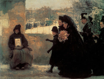
Look how the one boy without a hat stands out among the girls:
In the Church in Volandam, by Elizabeth Nourse
4. The farther away shapes are placed, the more isolated they feel. It creates tension.
illustration by Patricia Van Lubeck
All Saints Day, by Emile Friant
5. Space also implies time. When two shapes are far apart, it will take longer for them to come together.
Poppy Field, by Claude Monet, 1873
Note how Monet painted the same mother and child twice, emphasizing the time it takes
to paint a picture as opposed to photograph it. It's like he's saying, this is a painting of the scene,
This is what makes painting different.
6. A tangent is when two lines or shapes meet at just one point. You commonly learn about this in geometry, where a line just touches a circle:
But, every shape can connect with another at a tangent. It's something to beware when you're drawing:
An airport sketch, by James Gurney, with tangents circled in red.
Is that gasoline truck in front of or behind the wing of the plane?
The problem with tangents is it flattens a picture. It's hard to see, for example, if the wing of that airplane is in front or behind the gas truck below it. Remember, overlapping shapes show perspective, near and far, and establish which objects are most important. Without that, everything is equally awkward and confusing. And don't say, "But that's how it looked! I drew what I saw!" This is where you have to remember Stapleton Kearns, who said,
"You can't observe composition into a picture."
If what you see is objects touching each other at a tangent, then get up, walk around and find a better view. Here's another example:
Provencal Farm, by Henry Herbert La Thangue
Pirates, by Howard Pyle
Howard Pyle placed almost every shape here tangentially, as a way to flatten the work, like a playing card. He did it on purpose, maybe as an example of what not to do? Maybe as a joke? Try to count all the tangencies.
Having said that, tangents can be wonderful when done on purpose:
7. Shapes with hard edges stand out, separate from the rest of the work, like stickers you can peel off.
Portrait of Giovanna Tornabuoni, by Domenico Ghirlandaio, 1488
Soft shapes, however, suggest atmosphere, and fit into a picture better.
You can soften your shapes by blurring them like a camera, or by transitioning your values so that the darks get lighter and the lights get darker as they come together. The edge is still there, but it's softer.
8. One way to provide clarity to shapes is counter change. A shape gets lighter as it touches a dark background, and darker as it approaches a light background.
8. One way to provide clarity to shapes is counter change. A shape gets lighter as it touches a dark background, and darker as it approaches a light background.
The River Hornad, by me, T. Arthur Smith, 2012
9. Not all shapes look good. Some are elegant while others are inelegant, gaunt, coarse, vulgar, and ugly (which might be what you need, depending on the project). Another way of describing these shapes is dynamic versus static (boring) shapes. Dynamic shapes have gesture - a sweeping, flowing, graceful line that describes the basic shape. They are usually curving and asymmetrical. Static shapes generally have more of a straight gesture line.
WARNING: Be careful not to neglect your straight static lines and shapes - if a person is made up of all curves, and no bones, he becomes like a macaroni person and looks silly.
PRO TIP: You can draw a person standing straight up and symmetrical, and still make it dynamic if the smaller, secondary shapes are dynamic. The overall gesture may be a straight line, but all the muscles, shadows and drapery can still be quite dynamic.
It's not a question of science, there are no hard rules. It's more arbitrary - based on psychological connotations. It's a question of what the shape reminds you of. Our emotional response is based on our shared and personal experiences.


.jpg)

%20web.jpg)


Comments
Post a Comment