So, here is your artist's toolbox. It has everything you need to make great works of art, whether it be painting, sculpture, animation or any other art form. I'll try to make this short. But first, know this. Art making isn't simply like following a recipe where you have to be sure to use every single ingredient - as if that in itself were what makes art great. A great artwork is more than just a collection of lines, shapes and textures - the very notion of that (called Formalism) discounts the full impact of a work and its message, and, luckily, few artists ever got together to make a movement out of it. If that were all there is to art, I wouldn't make it. But, having said that, you need to know how to use these concepts in order to make great art:
Line
Lines are used to make shapes and divide space:
The lines that form the outline or silhouette of a shape or object are called contour lines:
Contour lines can be quite sophisticated, dividing shapes according to different planes or according to the light source:
illustration by Tom Scheuer
There are many kinds of lines. You can make a complex composition simply by using a variety of lines:
You can also create lovely abstractions just with lines:
Sometimes you don't even have to draw a line for people to see it, all you have to do is suggest it:
shapes and forms are pictorial figures made from lines.
Shape and form are synonymous. They're basically just blobs. They may represent real things, or they may be abstract. There are some textbooks and teachers who will argue that shapes are two dimensional (2D) while forms are 3D. I think it's fair to agree they have these associations - sculptors use the word 'form' when casting plaster molds of their work. But you can use the words interchangeably and people will understand you. Stan Prokopenko explains in his fundamentals video that artists improve as their shapes become more sophisticated and accurate:
Shapes can greatly affect the mood of a piece. We have strong emotional connections to shapes, depending on their size, texture, and so on. I talk about this more in this lesson. Focal PointThis is a center of interest that pulls your eyes towards it.
(Do you see the focal point?)
Focal points are made up of lines and-or shapes that stand out - due to various effects, such as isolation:
contrast (dark on light):
contrast (light on dark):
framing it:
greater detail and-or focus, etc.
portrait sketch by
Susan Lyon - note the difference in detail from the child's face to her clothing.
Volume
Volume, a term we borrow from science, suggests a 3D form - the idea of being able to reach in and grab a solid object.
Volume also suggests weight, because solid forms are heavy. A volume isn't a shape. When we talk about a "volume of water" it could have any shape, but the main thing is it's 3D. If a shape or form in a painting "has volume" it appears 3D. It isn't flat. If a sculpture has lots of volume, it is 3D - you might think that's obvious, but some sculptures are very thin:
Mass
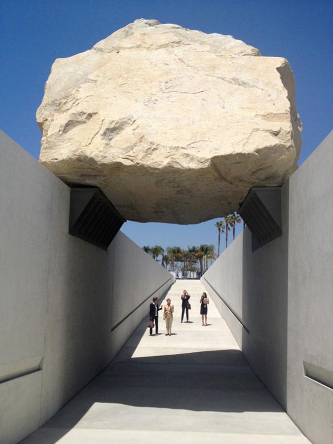
Mass, another term borrowed from science, is the opposite of empty space and is similar to volume. When people talk about the volume of a shape, they're talking about how it looks. When people talk about the mass of a shape, they're talking more about its weight. It's like two sides of the same coin. The word 'massive' means huge.
Levitated Mass, by Michael Heizer, 2012 SizeSize is a powerful tool in your art box, the key options being large and small.
It's important to remember that......size is relative.
The shapes in your work don't have to be extremely different in size. People will see them in relation to each other. So, a little circle is still huge compared to the dot next to it. Having said that, it can be fun to play with extreme size differences:
Stone Giant, by Layne Johnson
Also note, that size doesn't merely refer to the figures in a work, but the size of the work itself, which may be tiny:
or monumental:
The Guanyin of Nanshan, in China
Proportion
Proportion is what controls your shapes. It determines how tall, short, thin, or fat they are. Proportion is extremely important in realism. When drawing realistically you don't have to copy every detail you see - you're not a meat camera. But you do need to accurately see and copy the proportions, using your eye as a ruler and protractor, to measure lengths and angles.
Everything you see has specific proportions - but some are easier to play with than others. For example, there's not one universal proportion for trees and bushes. They come in all shapes and sizes.
People come in a variety of sizes as well, but there are still many proportional rules you must follow to create realistic figures and portraits. And it's confusing - many art books maintain the human body is so many heads tall (usually 7 1⁄2). An "idealized" body may be 8 heads tall.
Reality is often different:
I'll prepare an in-depth lesson on human proportions at a later date.
Space
Space is the area around your shapes. Positive space is made up of objects, and negative space is the empty area behind your objects.
Looking at negative shapes can help you to draw more accurately, finding and staying in proportion:
There are also many creative ways to use positive and negative space to create:
Color
It's peculiar how some color combinations can be beautiful while others are revolting. We respond to colors almost as if they were flavors.
Every color has the potential to be really beautiful, depending on how it's used and what it's paired with. It mostly has to do with how they work together (or don't) based on our collective memory and mental associations.
The three elements of color are:
hue - a color's position on a color wheel (presented below as a strip)
chroma - it's intensity or saturation
value/tone - it's range from light to dark. Value is also present when color isn't.
Colors can be flashy and help make artworks more memorable, because they tap into our emotions and memories. I talk more about the psychology of color in this lesson.Texture
Texture is the look and feel of a material. It can be rough or smooth, sharp or soft, flat or glossy, etc. Textures can also be real or implied. You can create real textures by adding thick layers of paint - a technique called impasto. Or you can glue objects to your picture surface, called collage. Or, you can paint so realistically that you capture textural effects. For example, certain art historians have claimed to be able to tell the locations and makers of the clothing worn by the sitters in Leonardo Da Vinci's paintings, just from the detail he put into his portraits.
Lady with an Ermine, by Da Vinci, c. 1489-91
Contrast
Contrast just means difference. People naturally see differences. If you use Photoshop or similar computer programs, you may think contrast is just about light and dark, but it's not. To quote illustrator Tristan Elwell:
"There are many different kinds of contrast, not just contrast of value. There's also contrast of hue, chroma, size, direction, texture, detail, etc. You use as many of these as possible (depending on your medium) to make the viewer look where you want them to. You can also use some to balance or compensate for others."
Molly Bang explains in her book, The Principles of Composition, that contrast is what enables us to see. Without contrast, everything would be an even fog of grey.
Perspective
Perspective is a trick of geometric design to create the illusion of 3D space on a 2D surface, based on a horizon line and vanishing points. There are different kinds of perspective, varying in complexity. To draw realistically you must learn to see and draw in perspective.
Symmetry & Balance
Symmetry is the division of space into smaller identical spaces and shapes. There are different kinds of symmetry. Most often, it functions like a mirror. There is also radial symmetry. Balance also divides pictorial space, but the resulting shapes are not identical. Balance suggests symmetry without being exact. It's more relaxed. I talk more about symmetry and balance in this lesson.
Repetition & Rhythm
The Lantern Bearers, by Maxfield Parrish, 1908
Repetition is when you repeat the same or similar line or shape several times in an artwork. Rhythm has to do more with where you put these repeated shapes and what line or shape is made when you look at them all together:


.jpg)


Comments
Post a Comment