5. Line Basics - Line Weight
Much of this lesson comes from this free video by Stan Prokopenko on Youtube.

concept sketch by Tyler Crook
Some are soft and light:

sketch of Zachariah, by Wesley Burt
The amount of power, or weight, a line has depends on its thickness, value, hardness (or softness), and most importantly, its contrast. The more contrast a line contains the more powerful it will appear.
NOTE: Thickness, value and hardness are factors that give a line more or less contrast.
Heavy lines are not always the darkest. On a dark surface, the brighter a line is, the heavier it will be:

Portrait of a Man, by Pavel Gazur
Line Weight is Relative.
Lines are heavy or light, strong or weak, in relation to each other. As Stan Prokopenko shows in this example, using the same heavy lines for an object makes it look flat and boring. It's thoughtless:

But, by adding weight selectively, Stan creates a much more interesting and believable form. It has more presence and impact:
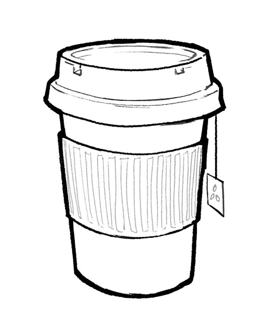
NOTE how he selected his line weights - the lid, cup, and paper sheath have darker lines to emphasize separation - they are separate objects. The lines of the paper sheath aren't as bold because they follow closely to the form of the cup - and the little texture in the sheath is very thin, because it's a part of that object. Same with the details of the lid - thin lines show it's a part of that shape - not separate.
Line weight is a useful tool in drawing. By varying your line weight you can enhance depth and form, indicate light and shadow, and create a hierarchy of what's most (and least) important in the drawing, thereby improving your compositions.
To Enhance Depth & Form
Generally, if you use heavier lines in the foreground, and progressively lighter lines as you go into the background, it will emphasize depth:

Engelsburg (now Pokrzywno, Poland), by John Singer Sargent, 1872
To Indicate Light & Shadow
If you use heavier lines on the shadow side of a shape, and thinner, lighter lines on the light side, it will indicate light and shadow. Comic book artists often do this to their contour lines. Can you see where the sun is shining from?

Batman sketch by Tyler Crook
To Create Compositional Hierarchy
You usually want to use your heaviest lines for your focal point, so people will see it first. Notice in this drawing, how most of the darkest lines are around faces - telling you to look at the faces first, to figure out what the people and animals are doing. This was done on purpose:

La Rue, by Theophile Steinlen, 1896
Steinlen and Mucha of the Art Nouveau movement were masters of composition, relying on various line weights to make their figures stand out:


To indicate local color
"Local color "is a term that describes the hue and chroma of a color regardless of the lighting. In the following example, Dave Malan uses line weight to indicate the subject's dark hair, sunglasses, and jacket:

Portrait of Godard, by Dave Malan
LEVEL 1 ASSIGNMENT - Still Life with Line Weight

THE SET UP: Paper, pencil, pen or thin marker (or brush pen), and an assortment of still life objects, set at 3/4 angles.
Draw your still life, starting loose and light with a pencil. When you're happy with your shapes, go over them with a thin pen line. Try to get all your lines evenly thin:

Next, consider which objects are closest to you and stand out from the rest, and darken those outlines - especially where shapes overlap. Think about separating objects and distance. Which objects are touching each other, and which are further apart? This should help add depth:

Now, consider the light source, where is it in the photo above? That's right, from the top right, hitting the front of the still life. How can we add some line weight to give an indication of that? And, while we're at it, what do we want as the compositional focus of this sketch? How about the cat's head? Let's use line weight to add some more contrast and interest to the face. How does this look? Is it better?

LEVEL 2 ASSIGNMENT - Loose Sketch of a Seal, Adding Line Weight

THE SET UP: Paper, pencil, and pen or thin marker, or brush pen.
Draw a loose sketch of this sea lion. As you do, consider which lines show the contours of its form - add weight to them. When I tried this assignment, I wound up drawing much more slowly and precisely than I had meant to:

I also couldn't help but shade a bit. This exercise doesn't require precision or shading, just to think about line weight. I drew a second example, to show what I mean:

Keep the interior lines thin and light. Whatever comes forward in the reference - its flippers for example, draw darker. As objects go farther back, make the lines progressively thinner and lighter. Also, try thicker lines beneath the forms to emphasize occlusion shadows. Try some more sketches like this:


LEVEL 2 ASSIGNMENT - Loose Sketch of a Building, Adding Line Weight


THE SET UP: Paper, pencil, pen (or brush pen), and either a photo to work from, or work from life.
Try to draw the building in the same method as the seals and sea lions above - draw the basic shapes, and add line weight as necessary.


LEVEL 3 ASSIGNMENT - Loose Sketch of Pedestrians, adding Line Weight
THE SET UP: paper and pencil.
It's best to do this from life - go where people tend to congregate and relax, like a local park.
LEVEL 3 ASSIGNMENT - Loose Sketch of a Rhinoceros, adding Line Weight


THE SET UP: paper and pencil.
Draw a loose sketch of the rhino, varying your line weights.


Comments
Post a Comment