The Goals of Composition
Composition is one of the hardest subjects to teach and explain. Most people do a poor job of it - the knowledge required is not easily or widely available, and most of what is taught often feels cryptic, unintuitive, or just wrong - and there is a lot of misinformation thrown in the mix. Typically, it starts and ends with your teacher giving you a nice little list of terms - ideas fundamental to planning a composition. It usually looks like this:
line, shape, form, space (positive & negative), size, mass, color, value (chiaroscuro), contrast, rhythm, repetition, balance, emphasis, economy, movement, and unity.Every teacher makes their own list, and they sometimes change the words around. You get to see an example or two for each item, maybe they mention the "Rule of Thirds", and they hope you get the idea. And you do, kind of... But, not so many teachers will tell you how to use these fundamental tools effectively in your art, and that's the thing. Seeing this in examples is easy and intuitive. But, actually using them, and implementing core ideas about composition in your work - that is not intuitive. It takes years of practice.
Even worse, many students get the wrong impression that each artwork must use these tools in the same way, and that the ultimate goal of all artwork is balance and harmony... It's not. There is not one shared goal in art. If you look at art history, it's mostly one movement after another rebelling against the accepted mission of art in favor of something better, or at least contrary to it. Furthermore, the fact that so many artists have focused on creating great compositions does not mean a great composition was their primary concern, just like great writers don't write novels to show off their wonderful vocabularies or skills in grammar. As Stephen King says, the goal of writing is to make readers forget they're reading as they immerse themselves into the story.
And so it is with painting. The notion that a perfect composition, as defined by the use of its elements, is the purpose or definition of art is a myth propagated under Formalism, which, if you look it up, has never been a major movement with artists, but merely its critics - the same critics, by the way, who try to separate ethics from art.
I'm not writing all this to blame your teachers, or put anyone on the spot. I'm certainly no master myself. The sad fact is that this is a branch of knowledge that's mostly lost. As Chris Bennett explains:
"Understanding the engine behind these codes is what enables you to speak as an artist. Unfortunately, I know of no book that addresses this comprehensively. You have to find it by asking yourself some tough questions about what on earth it is you are doing, what it is for and why you are not trying to do it in any other, more expedient, way."
I remember when illustrator Donato Giancola showcased this illustration, on Conceptart.org (a wonderful website that sadly passed away):

Between the well-deserved praise, one student asked, and I'm paraphrasing here, "I don't get it. Everyone's complimenting the composition, but I don't see a good composition. There's no order or harmony, all I see is chaos." It was a great question, it showed he was experiencing a disconnect between what he heard in school with what he was seeing online from professional painters. And people were quick to inform him:
The goal is to paint a place that's attractive enough,
 The Heart of the Andes, by Frederic Church
or dramatic enough,
 study, by Bruno Gentile
that people would want to go there. Some artists look for beauty in less than ideal places,

 Haunted, by Jama Jurabaev

2. The formal approach: Use the same principles borrowed from landscape painting to make the work as beautiful as possible. Focus on the colors, the play of light, the arrangement of elegant shapes, etc.


3. Fill the painting with meaning through symbolism. With hidden meaning, the still life becomes more like a mystery to solve, or at least a witty joke.

.jpg)
.jpg)

- Use abstraction to warp and distort what you see. Give enough clues so the viewer can decipher it. It's another form of puzzle making.


 Caroline, by John Michael Carter
Others use portraiture as a way to mock:
 Jack Nicholson, by Patri Balanovsky
 The Ugly Duchess, by Quentin Matsys
And then, some artists use a face as a reference point to focus more on mood or expression, which is great. It's less of a portrait than a vision:


 Falling Leaves, by Ivan Goryushkin-Sorokopudov

 Miss Helen Sowerby, by James Guthrie


 Baby, by Gustav Klimt

I would say this kind of work has less to do with portraiture, and more to do with illustrating a feeling. The person is merely a vehicle for delivering that feeling.

In illustration, artists worry about:


 Red, Orange, & Yellow by Mark Rothko
When working non-representationally, you have all the same concerns as before - beauty, balance, harmony, mood, honesty, readability. But, in a way, you and your audience are working blind, with nothing recognizable to hold on to and make sense of things. So, abstract art always presents a bit of mystery and puzzlement. The challenge is in forming enough of a picture to excite the viewer, so that they want to think about it.
 Combat - Light & Shade, by August Herbin

"There has not been, as yet, a book written that
promotes understanding of what is unique about and peculiar to the vocabulary
and grammar of painting. The formulas and 'tips' contained in these volumes are
generally providing codes for replicating ways of building images.
"Its a situation rather like someone learning the guitar by memorising chord
shapes in sequence to play their favourite songs without having any idea about
the grammar of harmony. It sounds like they know their instrument, but only if
they are asked to play their party pieces.
"So, for example, in a book about landscape composition, all we are getting is a couple of generalised pointers about how to make one's efforts 'balance' by superimposing a vague template crudely sifted from some successful pictures in the past. Knowledge' used in this fashion is in fact a prison.
"So, for example, in a book about landscape composition, all we are getting is a couple of generalised pointers about how to make one's efforts 'balance' by superimposing a vague template crudely sifted from some successful pictures in the past. Knowledge' used in this fashion is in fact a prison.
"Understanding the engine behind these codes is what enables you to speak as an artist. Unfortunately, I know of no book that addresses this comprehensively. You have to find it by asking yourself some tough questions about what on earth it is you are doing, what it is for and why you are not trying to do it in any other, more expedient, way."
I remember when illustrator Donato Giancola showcased this illustration, on Conceptart.org (a wonderful website that sadly passed away):

Archer of the Rose, by Donato Giancola
Between the well-deserved praise, one student asked, and I'm paraphrasing here, "I don't get it. Everyone's complimenting the composition, but I don't see a good composition. There's no order or harmony, all I see is chaos." It was a great question, it showed he was experiencing a disconnect between what he heard in school with what he was seeing online from professional painters. And people were quick to inform him:
Not all art has the same goals.
An artist painting a battle does not have the same concerns as someone painting a flower pot, or a sunset, or waves crashing on the beach.
How you plan a composition depends on what you're making.
So, What Are the Goals of Composition?
Good question! There's no simple answer. Every artwork has its own goals as it creates its own universe, and you have to think about it. But, depending on the subject, there is usually some basic goal that is expected:
In Landscape - Beauty
The goal is to paint a place that's attractive enough,

or dramatic enough,

that people would want to go there. Some artists look for beauty in less than ideal places,

bustation, by Staats Fasoldt
and some artists care more about romanticizing nature - creating a mood.

But, usually, they use composition to:
- create the illusion of depth
- create a sense of atmosphere
- create attractive, elegant shapes, and place them together in harmony
- choose a focal point (or several focal points)
- focus on the play of light and shadow
- focus on weather effects, like rain, mist, fog, snow, reflections, etc.
- focus on weather effects, like rain, mist, fog, snow, reflections, etc.
The overall effect is to present a location that is fascinating. Perhaps there are people in it? Perhaps it tells a story, but you generally want to create a place people would like to go to. Paintings in this subject are like windows to another world.
In Still Life - Interest
The challenge of still life is how to make ordinary objects into something exciting. After all, it's just stuff. What's more, most art aficionados consider still-lifes to be student endeavors, academic training for beginners who wrestle with making realistic forms. So, how do you push the subject to a higher art? Painters have taken a variety of approaches:
1. Paint so realistically that the viewer feels she can reach in and take something out.
1. Paint so realistically that the viewer feels she can reach in and take something out.

Breakfast Table with Blackberry Pie, by Willem Claeszoon Heda
2. The formal approach: Use the same principles borrowed from landscape painting to make the work as beautiful as possible. Focus on the colors, the play of light, the arrangement of elegant shapes, etc.

Still Life with Apples & Oranges, by Paul Cezanne

Still Life with Brass & Glass, by William Merritt Chase
3. Fill the painting with meaning through symbolism. With hidden meaning, the still life becomes more like a mystery to solve, or at least a witty joke.

Allegory, by Antonio de Pereda
.jpg)
Still Life by Amanda Grieve
Rock, Paper, Scissors, by Elaine Kurie

Ars Longa, by me - T. Arthur Smith
- Use abstraction to warp and distort what you see. Give enough clues so the viewer can decipher it. It's another form of puzzle making.

Still Life with Chair Caning, by Pablo Picasso
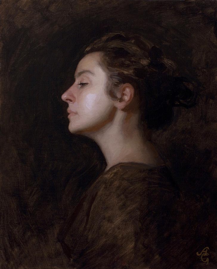
In Portraiture - Honesty
Beauty and interest matter in portraiture, obviously. But the most important aspect to portraiture has to be honesty. When you paint a portrait, you're producing a record of who that person really was. It will last for ages, and people will expect and want an honest representation, especially of important historical figures. We want to know what the real Caesar looked like,

the real Queen Elizabeth

and King Henry VIII,

the real Alexander the Great.

In portraiture, honesty is more than just capturing a likeness. The facial expression is key. It should indicate the sitter's temperament, mood, intellect, etc. The background should emphasize the sitter's world, where they live, how they live. A great portrait tells the story of a person's life:

Mrs. Zimmerman, by Rose Frantzen
There are other goals in portraiture. Some artists care more about flattery, making the sitter look as good as possible:

Others use portraiture as a way to mock:


(Never anger an artist)
And then, some artists use a face as a reference point to focus more on mood or expression, which is great. It's less of a portrait than a vision:

Isabella and the Pot of Basil, by John White Alexander

Spanish Dancer at the Moulin Rouge, by Giovanni Boldini

Pot Pourri, by Herbert Draper

Heather, by Adrian Gottlieb


Fiery Light, by Ignat Ignatov

illustration by Michael Johnson


Sketch, by Luke Kopycinski
I would say this kind of work has less to do with portraiture, and more to do with illustrating a feeling. The person is merely a vehicle for delivering that feeling.
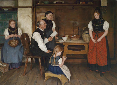
In Figurative Illustration - The Story
Beauty, interest, and honesty all matter. But, when you add several people into a painting who are all acting out a story, a new challenge emerges - readability. The viewer wants to know what is going on, so the artist has to make it clear, while still worrying about beauty, realism, and the mood of the story and setting, etc. It's a challenge, similar to planning a scene in a film, which is why most films start as storyboard drawings:

storyboard for Forest Gump, by Chris Bonura
In illustration, artists worry about:
- the poses, how figures are standing, their body language.
- expressing movement and action
- facial expressions
- camera angle. Where is the viewer in this scene? How can the viewers be
made to feel like they're in the scene?
- color and emotion, do the colors fit the scene?
made to feel like they're in the scene?
- color and emotion, do the colors fit the scene?
- the bigger picture. What's happening in this scene, and what's going to
happen?
happen?
The greatest artists understand all this and use it to make a picture that tells a story - worth thousands of words.

The Letter, by Alma Erdmann

Spectre, by Frederic Rodrigo Gruger

World War 2 Illustration by Noel Sickles


Illustration for Close Shave, by Albert Dorne

Faramir at Osgiliath, by Donato Giancola

Cities of Mystery by Larry Elmore


In Abstract Art - All of the Above
First of all, there are levels of abstraction. All art is abstract to a degree, simplifying nature, no matter how detailed or accurate the work. When artwork skips reality all together, we call it non-representational.

When working non-representationally, you have all the same concerns as before - beauty, balance, harmony, mood, honesty, readability. But, in a way, you and your audience are working blind, with nothing recognizable to hold on to and make sense of things. So, abstract art always presents a bit of mystery and puzzlement. The challenge is in forming enough of a picture to excite the viewer, so that they want to think about it.


Aria de Bach, by Georges Braque

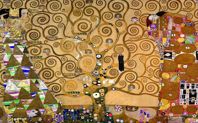
Tree of Life, by Gustav Klimt

Comments
Post a Comment